Learn the language of FLIP
Channel

- The icon is chosen from your organization's icon library (which can be customized to your brand). A custom icon can be uploaded upon request.
- The color of the icon can be customized to be on-brand as well.
Bookcase Line

- There is no character limit. The best practice is to create something unique. Do not be afraid to be descriptive.
Bookcase

- The text color can be customized to be on-brand.
- There is no character limit, but the best practice is to keep it very short.
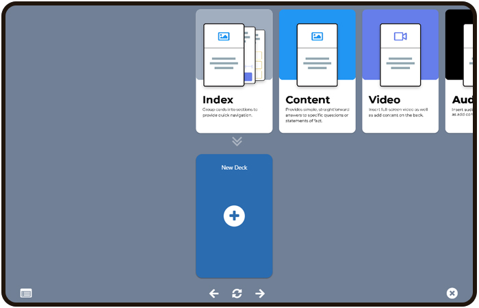
Deck Line

- There is no character limit. The best practice is to create something unique. Do not be afraid to be descriptive.
Deck
- The Deck has the option to add a full-bleed image.
- The Deck's title is displayed below the deck.
Deck Line Search
- The search results are from only the Decks in the Deck Line.
Deck Cover

- The color and icon can be customized to your brand.
- A full-bleed image can be uploaded.
Deck Navigation
The icons at the bottom of the Deck each have a specific function.
Index Icon
- This icon will jump you to the index Card wherever you are in the Deck.
Left Arrow
- This will move the Card Line one Card to the left.
Flip Icon
- This icon will flip the Card over.
Right Arrow
- This icon moves the Card Line to the right one Card.
Close Button
- This icon will close the Deck
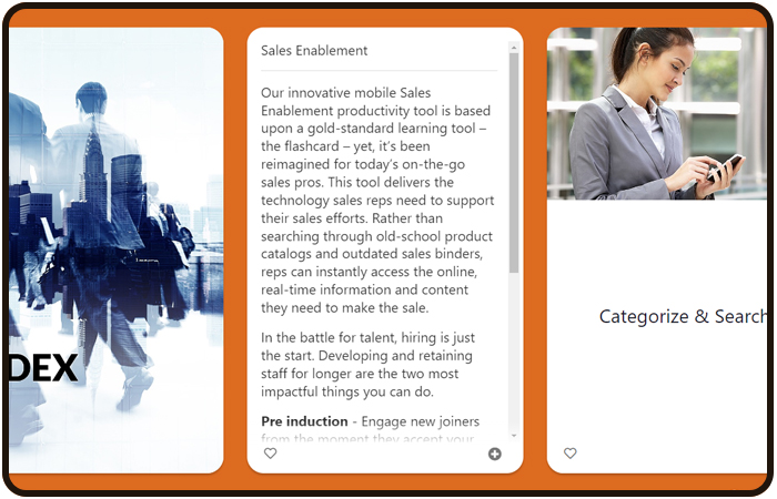
Card
A Card is the smallest content container in FLIP. Visually represented by a rounded edge vertical rectangle.
- The front side does not scroll, so the best practice is to keep the verbiage on it short.
- You can add two sizes of imagery. (Golden: 700px X 438px & Full-bleed: 700px X 1133px).
- The Backside scrolls. It is best practice to keep the content to around 3000 characters.
- You can add imagery, audio, video, and much more. Find more details in the Card section.
Card Line

Card Front
Card Back
- It is best practice to keep the content to around 3000 characters.
Index Card

- No other cards can be placed before an Index card.
Index Section
A select group of Cards within the index. The section is expandable to view the Cards within it.

Resources

- File upload
- Document
- Website
- Video
- Image
- Email - Add the pre-fix "mailto:"
- Phone - Add the pre-fix "tel:"
Flip a Card
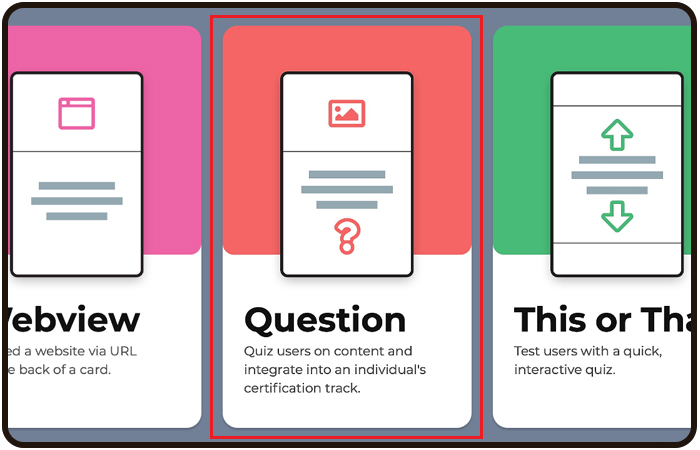
Knowledge Check
Assessment
A certifiable quiz that contains content Cards that refer to the questions within:
- Are linked to a company’s LMS.
- Produces a Certificate Card upon completion.
- Option for Users to re-test their knowledge for incorrect answers.
- User attempt limits
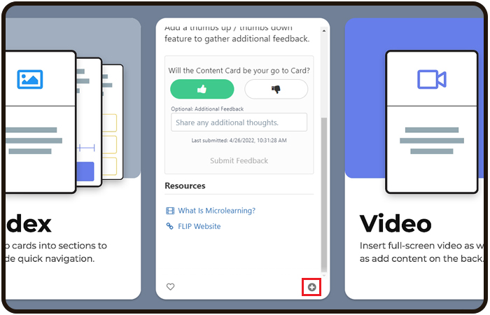
Custom Icon
A circle-shaped + icon that allows a user to save a Card to a custom, personalized Deck. Located in the bottom right of a Card. Users can tuck a Card to create their own custom Decks that live on their own My Favorites section accessible from the Homepage. Users can add any number of Cards to a custom Deck and can create as many Custom Decks as they want.
Tucking a Card
User Deck
My Favorites Section

Custom Created Deck

Favorite Icon
A heart-shaped icon that duplicates a Card into a Favorites Deck is located on the Homepage of the platform under the "My Decks" Category. Located in the bottom left of a Card.

Favorited Card
The Card that is favorited will be displayed in the My Favorites section accessible from the Home page.
My Favorites Section

Favorited Card

The Deck of the favorited Card will be displayed in this section.
Global Search
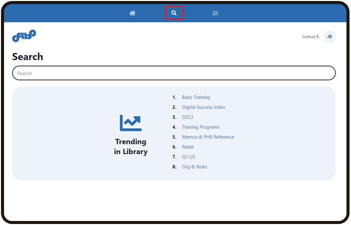
- Accessible by the center icon.
- Search is also available on each screen from the search bar.
Library
The visual display of the user’s available content.
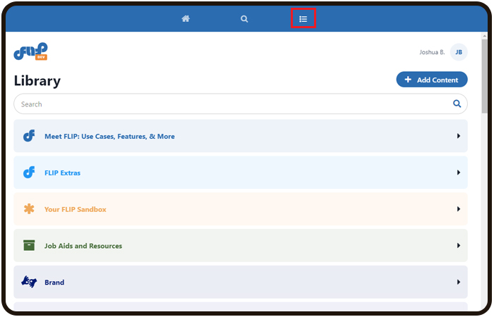
- Accessible by the right icon.
Home

Dynamic Content

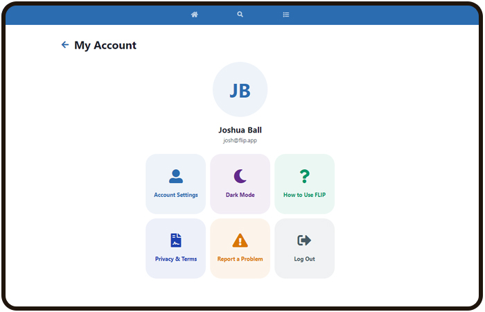
Account Settings
This menu has the user’s info and app functions displayed. Icon located in the top right of the screen.

My Account Screen
Connection
Provides the user with content. A connection is a visual key for the User; in order for a User to see a Card, the User and the Card must share the same Connection. Connections have their own unique QR code or text code for shareability.

Trigger
- Answer a question in a Question Card
- Answered all questions in a This/That Card
- Answer a Likert question
- All assessments complete
- Button press
- Finished a video
- Finish all videos in a deck
Promo

- Library
- Homepage
- Specific Channel
Competition
User
Admin
An individual who has administrative access to the FLIP app.
Admin Portal
An administrative web-based content builder with a reporting suite.
Notification
Special Notice
Was this article helpful?
That’s Great!
Thank you for your feedback
Sorry! We couldn't be helpful
Thank you for your feedback
Feedback sent
We appreciate your effort and will try to fix the article