TABLE OF CONTENTS
- Cards Overview
- Different Card Type Templates
- Specific Card Type Features
- Content Card
- Video Card
- Playlist Card
- Embedded File Card
- Question Card
- This or That Card
- Feedback Card
- Discussion Card
- Order Up Card
- Likert Card
- Webview Card
Cards Overview
Different Card Type Templates
- Content
- Video
- Embedded File
- Question
- This or That
- Feedback
- Discussion
- Order Up
- Likert
- WebView
- Playlist
When you click the Create Card button, you will be shown this menu to choose your template from. Simply click on the one
you would like to build, and you will be taken to its editing screen.

The front of the Card's options and features are the same for each of the templates.
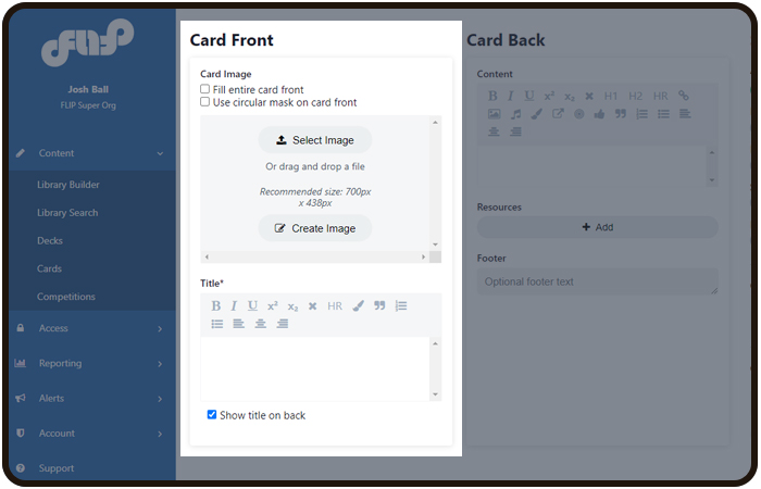
- Fill entire front: You can choose for your image to fill up the entire front. This is the full-bleed option.
You must check this box first before uploading your full-bleed image. The size for this image is 700px X 1133px.- If you choose not to check this option, the default image size is 700px X 438px. This is referred to as the
golden image, as its size is determined by the golden ratio.
- If you choose not to check this option, the default image size is 700px X 438px. This is referred to as the
- Use circular mask on card front: You may choose to crop your image in a circle. This will automatically create a
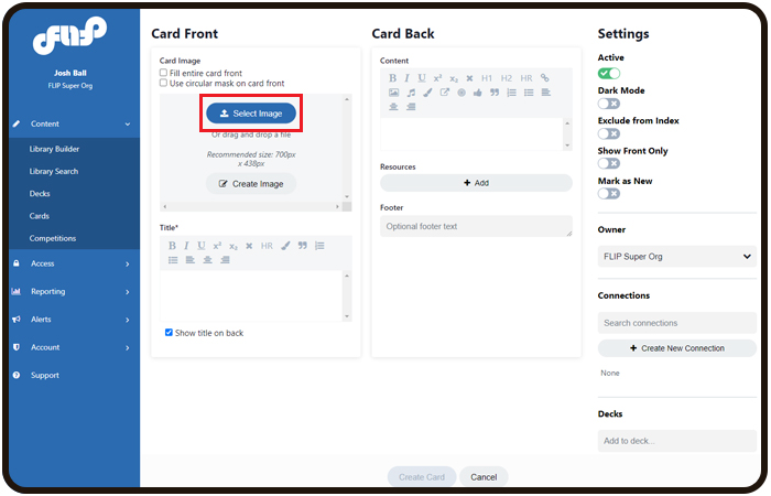
pre-determined circle from the center of your image. - Select Image: This will open up a window for you to locate an image from your computer. *More detail below.
- Create Image: You can create a basic graphic for the front (text, shapes, and icons). **More detail below.
- Title: This is the area to add your text for the front of the Card. Keep in mind that the text does size dynamically
- depending on how many characters there are, i.e., the more text, the smaller the size will be. The best practice is
to stay around 140 characters. A basic WYSIWYG is provided for some small editing. You can also choose to show
the title at the top of the back of the Card.

on

- The bottom tool features include: Shape, Filter, Text, Flip, Draw, Icon, Mask, and Rotate
- Send Item: Move graphics/fonts above or below other objects
- Apply Flat Background: This option will overlay a solid color on your image. This option is not recommended
when you have an image as the background. - Select Font: You can choose different fonts.


In the editor screen, you have the ability to create simple graphics and add text.
- The bottom tool features include: Shape, Filter, Text, Flip, Draw, Icon, Mask, and Rotate
- Send Item: Move graphics/fonts above or below other objects
- Apply Flat Background: This option will overlay a solid color on your image.
- Select Font: You can choose different fonts.

When you are in the Card editor screen, you will notice quite a few options on the far right side of the screen. Below are these options listed out and detailed so you can get familiar with them. Feel free to experiment with them when creating your Cards.
- Breadcrumb: This is located at the very top left of the screen. You are able to go back to the Deck editor screen.
- Preview in Emulator: This is located at the very top right of the screen. This button will launch a simulated version of
the app. - Previous Card: This is located at the very top right of the screen. This will navigate to the previous Card in the Deck.
- Next Card: This is located at the very top right of the screen. This will navigate to the nextCard in the Deck.
- Active: This toggle will visually turn the Card on/off.
- Dark mode: This changes the Card's background to a dark grey and inverses the font colors. Note: if you have
imagery on the back of a dark mode card, you will need to make sure the image's background matches, or is a
transparent .png. - Exclude from Index: Toggling this on will not show the Card in the Index Card. This can be useful if you decide to
make a divider Card and do not need it to be listed in the index. - Show Front Only: Activating this will prevent the Card from flipping.
- Mark as new: Adds a "new" flag on the front of the Card, as well as highlights the Card in the index.
- Search/Create a connection: Every Card needs a connection to be visible. This is where you can search for existing connections. Best practices are to search for existing Connections before having to create a new one.
- Add/Create a Deck: Typically you should never need to create or search for a Deck if you follow the top-down
approach of building content. However, if you have created a Card by itself, it will need to live within a Deck.
Best practices are to add to an existing Deck before having to create a new one. - Tags: You can manually add a tag to a Card one at a time, or choose the Auto-tag option to add multiple AI tags,
powered by Watson. Tags help with the search. The best practice is to use the Meduim Auto-tag feature. - Card statistics: We provide you with data about the Card; its template type, owner, when it was created, and last
updated. - View admin audit: See all activity from admins who have worked on the Card.
This is a special permission for Super-Admin. - Copy link for App: Copies a direct link to the Card onto your clipboard. You can then add that link to email
communications or however, you would like to share the link. This is a special permission for Super-Admin. - Duplicate Card: Creates a copy of the Card. You will also be able to carry over the connection from the original Card.
- Delete Card: You do have the opportunity to delete Cards, however, you will need to remove any and all connections
and remove the Deck first.
Specific Card Type Features
We will dive into each Card template and their specific features. The focus will be on the back of the
Card, since this is where the differences come in. As mentioned before, all of the templates have the
same features for the fronts of the Card, as well as the general options on the right of the Card
editor screen.
Content Card
This Card type is the work-horse of the platform, it is the most used Card amongst the other card types.
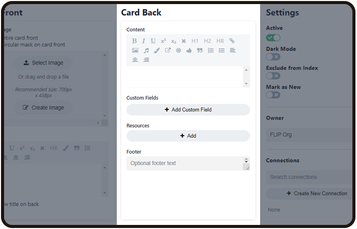
- Content: This works like your standard text editor (MS Word) with a WYSIWYG. The features in the WYSIWYG are; bold, italic, underline, superscript, sub-script, clear, header 1, header 2, horizontal rule, hyperlink, import image, import audio,
font color, trigger button (this adds/removes connection upon pressing), shuttle button (this shuttles to other Cards
within the Deck), add thumbs up component, quote, number, bullets, left, centered, and right justifications. - Resource: You can add external links to different types of resources. Clicking the Add button launches a modal that
allows you to choose the type of resource and destination. - Footer: Input footer text to be displayed at the bottom of the Card. This text will display in a smaller font than the
rest of the text on the Card.

Video Card
- Video: Add a link from well-known video players or Upload a video from your computer. You can link to videos from
Vimeo, YouTube, and Brightcove. Make sure the videos you are linking to are publicly available. The platform cannot
link to any video that is private. - Description: input text with our full WYSIWYG options.
- Thumbnail: Add an image that appears in place of the video before the play button is clicked. This image should be
700 px x 438px. - Subtitles: When you upload a .MP4 file directly to FLIP, you can also upload your own .VTT subtitle file to properly
display subtitles in the app. Learn more about VTT files here. - Resource: You can add external links to different types of resources. Clicking the Add button launches a modal that
allows you to choose the type of resource and destination. - Footer: Input footer text to be displayed at the bottom of the Card. This text will display in a smaller font than the
rest of the text on the Card.

Playlist Card
You can add multiple audio tracks on the back of a card to set up a playlist with this template. The
user can play the first track, close the Deck, and all of the tracks will play in order, like a podcast.
You will notice this template only has the option to add audio tracks. There is no WYSIWYG provided.
Upon clicking the Add Track button a modal will pop up.

- Audio File: Choose an audio track file (mp3/mp4/wav/ogg/flac formats) from your computer.
- Episode Details: Each audio track is called an episode and each episode has options.
- Title: Provide a unique title for the episode.
- Description: Add a description for the episode. There is no character limit and there is a robust WYSIWYG
provided. - Image: You are able to upload a unique image for each episode that will display in the details for the user.

- Edit a track
- Re-Order all tracks
- Delete a track

Embedded File Card
- Embedded File: Upload any file type.
- Content: This works like your standard text editor (MS Word) with a WYSIWYG. The features in the WYSIWYG are; bold, italic, underline, superscript, sub-script, clear, header 1, header 2, horizontal rule, hyperlink, import image, import audio,
font color, trigger button (this adds/removes connection upon pressing), shuttle button (this shuttles to other Cards
within the Deck), add thumbs up component, quote, number, bullets, left, centered, and right justifications. - Resource: You can add external links to different types of resources. Clicking the Add button launches a modal that
allows you to choose the type of resource and destination. - Footer: Input footer text to be displayed at the bottom of the Card. This text will display in a smaller font than the
rest of the text on the Card.

Question Card
- Content: This works like your standard text editor (MS Word) with a WYSIWYG. The features in the WYSIWYG are;
bold, italic, underline, superscript, sub-script, clear, header 1, header 2, horizontal rule, hyperlink, import image, import audio,
font color, trigger button (this adds/removes connection upon pressing), shuttle button (this shuttles to other Cards
within the Deck), add thumbs up component, quote, number, bullets, left, centered, and right justifications. - Answers: Add an answer. You can add as many as you would like.
- Add Variant: You can add a different version of the answer. This prevents users from providing the answer to
peers. - Add Remediation: Remediation can be a general "correct/incorrect" OR choose specific remediation for each
answer.
- Add Variant: You can add a different version of the answer. This prevents users from providing the answer to
- Options: Choose different options for the behavior of the Card. Note: Knowledge check is checked by default.

- When answered correctly, show the question again after XX amount of time.
- When answered incorrectly, show the question again after XX amount of time.
- Show again until answered correctly: Limit the number of times the user can see the answers.

This or That Card
- Answer labels: Choose from pre-determined answer buckets (Do/Don't, True/False, Option 1/Option 2, Myth/Fact).
- Top Option: Create a custom answer bucket.
- Bottom Option: Create a custom answer bucket.
- Options: You can choose survey mode.
- Question: Add a question. You can add as many questions as you would like. Questions will display randomly in-app.
The best practice is to limit the questions to around 5.

Once you click on the Add Question button, a text editor field will appear with the option to choose the answer it goes with.

Feedback Card
- Content: An text editor with WYSIWYG.
- Custom Fields: Add as many custom input fields as you need.
- Resource: You can add external links to different types of resources. Clicking the Add button launches a modal that
allows you to choose the type of resource and destination. - Footer: Input footer text to be displayed at the bottom of the Card. This text will display in a smaller font than the
rest of the text on the Card.
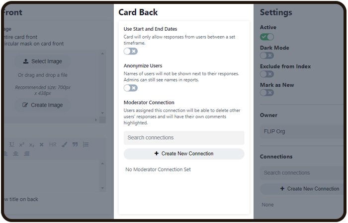
Discussion Card
- Use Start and End Dates: Set a date range to allow responses.
- Anonymize Users: You are able to make the participants anonymous.
- Moderator Connection: Add a Moderator connection and provide that connection to a user of your choice.
Order Up Card
- Content: An text editor with a WYSIWYG.
- Answers:Add answer options. Answers can be re-arranged.
- Add Remediation Content: If you choose to make the order specific, you can add feedback based on if the
order is correct or incorrect.
- Add Remediation Content: If you choose to make the order specific, you can add feedback based on if the
- Options: Choose survey mode for no wrong order.

Likert Card
- Content: A text editor with WYSIWYG.
- Ticks: Choose the number of ticks you would like on your scale.
- Min Value: Determine the minimum value of the far left tick.
- Max Value: Determine the maximum value of the far right tick.
- Tick Labels: Provide each tick with a unique title. The titles will be displayed just above the scale.
- Likert Options: Choose to show the first and last title or just the number values of the ticks.
- Resource: You can add external links to different types of resources. Clicking the Add button launches a modal that
allows you to choose the type of resource and destination.

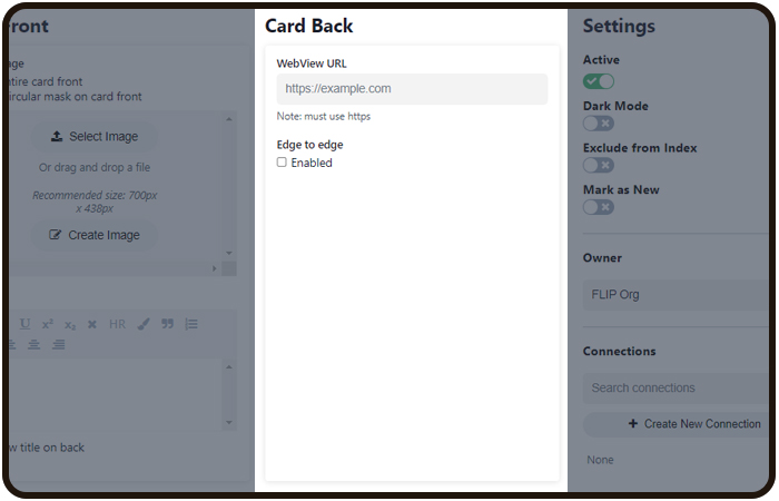
Webview Card
This template allows you to embed a website via URL on the back of a card. This is useful if you
need to provide a lot of specific information or a tool from an existing website.
- WebView URL: Copy and paste the URL you want to display.
- Edge to edge: Choose to display the website at full-bleed.
Was this article helpful?
That’s Great!
Thank you for your feedback
Sorry! We couldn't be helpful
Thank you for your feedback
Feedback sent
We appreciate your effort and will try to fix the article